
In a move that signals both modernity and nostalgia, the Metropolitan Transportation Authority (MTA) has introduced a completely redesigned version of New York City’s iconic subway map. This is the first substantial visual overhaul of the system’s layout in nearly half a century—an announcement that has generated significant interest, reflection, and in true New York fashion, a fair amount of debate.
The subway map is more than just a guide for navigating the city’s vast underground network. Over the years, it has become part of New York’s identity, a symbol of its complexity, its pulse, and its constant movement. For locals, it’s a daily reference; for visitors, often the first point of contact with the city’s energy. Changing it, even visually, is no minor detail—it’s an evolution in how the city sees itself, and how it wants to be seen.
A Contemporary Aesthetic for a Classic System
The new design introduces a cleaner, more modern aesthetic: bold, simplified lines on a crisp white background, with updated typography and a decluttered layout. It’s a stark contrast to the denser, more information-rich map used for decades. The MTA’s intention was to make the map more legible in digital formats, aligning with the way many people now interact with transit systems—on screens, rather than in print.
This minimalism, however, comes at a cost. While some applaud the clarity of the new design, others argue that the map now omits certain contextual details that helped users, especially infrequent riders, better understand the city’s geography and subway flow. The new map, according to critics, may be aesthetically pleasing but potentially less intuitive for those unfamiliar with the system.
A City in Transition
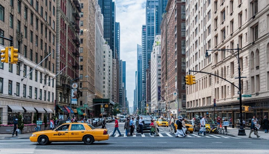
This redesign should be understood in a broader context. New York is a city that is constantly changing—socially, architecturally, and culturally. The updated subway map reflects not only the city’s desire to modernize but also its attempt to streamline communication in an increasingly fast-paced and digital world.
Yet, it also raises a question about what gets lost in the process of modernization. Is simplification always beneficial? Or does it risk erasing the richness of a city whose value lies precisely in its layered complexity? These are not just design questions—they speak to the heart of how people experience New York, whether as residents or as travelers discovering it for the first time.
What Travelers Should Know
For those planning to visit the city, this change is worth noting. It won’t alter how the subway itself functions, but it might affect how it’s perceived and approached. At Fattori Travel Experiences, we believe in staying informed about the evolving landscape of each destination—not only in terms of the places to see or the luxury services to enjoy, but also the subtler shifts that define the spirit of a city.
The new subway map is one of those shifts. It’s a design update, yes, but also a cultural statement. It says something about where New York is heading, how it communicates with the world, and how it wishes to present itself in the years to come.
Have you ever used the subway in New York? What was your experience like—confusing, efficient, unforgettable? Let us know in the comments below. We’re always curious to hear how travelers navigate this ever-evolving city.